


Last weekend I was having an idle time, away for a joint
family birthday.
I took a moment to look around the room.
In my bag was very new kindle with its covetable green
leather cover.
Nice, eh?
Meanwhile, on my lap, was a just-opened present: a 3D real-world copy of
“Just My Type” by Simon Garfield, a book about the design history of
fonts. I have always loved
the subject and heard the book being read on BBCR4 back in December.
The two things seemed almost opposites, in their way.
One artefact – the kindle - uses a fits-all-genres font, apart from variations in size. The standard page layout makes no attempt at beauty, beyond the words in the
reader’s mind - and sometimes that can be or should be enough. The
kindle doesn’t attract or distract me with presentation skills What it offers is portability and choice, no matter how far away I am from the
book hills of home.
 Meanwhile, the "Just My Type" book explains how fonts
and layouts can be purposeful, sympathetic, arresting, calming, historic,
modern, dominating, overwhelming and more.
Meanwhile, the "Just My Type" book explains how fonts
and layouts can be purposeful, sympathetic, arresting, calming, historic,
modern, dominating, overwhelming and more.
Fonts even give away too much about
personal choice, or so he suggests, according to the blurb.
The pages inside
this partiular book offer b&w photographs and old engraved images and font samples and
there are wide satisfying borders and headings and some stylish page numbering.
This
book's design has added pleasure to the content. The layout adds much to the words, makingthe whole the
book more than just the text. And it's barely even trying!
Oh, they are such hidden heroes, all these clever book designers! I love and admire them for their many skills but also because as a writer, they can be my best friend. I want my words to look as
good as possible on the page because it matters. The layout, size and choice of font, size and shape of pages,
even the quality of paper all work together to enhance the words and help the
reader.
Such things matter, especially to the young reader as well as to the
writer. There is something soul-destroying about a story appearing on
thin, poor-quality paper in a font so small and dense that it repels any
but the most keen and competent readers.
 Text needs a sense of space. Although this classic picture book had Helen Oxenbury's wonderful illustrations and Michaele Rosen's rhythmic retelling, I am convinced that the generous, airy layout of "We're Going on A Bear Hunt" was also a reason for its success with grown-ups and children alike.
I've got, somewhere, the earlier, traditional "Lion Hunt" version in a cheap and nasty anthology. Only the thought of the fun you could have reciting and acting the words with groups of kids made those pages useable.

Nearly forgot. Back to my weekend. Close by, on the cupboard was a copy of "The
Marlowe Papers", a historic novel by Ros Barber, written in poem form. It was graced
by a beautiful hardback cover whose colour, texture and old-fashioned titling
suggested both “this is an important work” and “timeless quality.” In more than a hint.
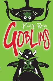 Beside that lay a copy of Philip Reeve’s highly noticeable “Goblins”.
The
publisher’s choice of bright emerald page-edging, completing the bright green
covers, transformed the book into a block of noticeably brilliant green.
“Pick me up. I’m an exciting container and I’ll fit right in your hand,” it screamed.
Both items demonstrated the entire “bookishness” of
the object. “This is not an e-book,” they were clearly stating. “This is more
than an e-book. Hold me. Read me.”
 Meanwhile, there’s another present: Leonard Cohen’s “book of
longing”.
Meanwhile, there’s another present: Leonard Cohen’s “book of
longing”.
Those pages are full of poems and motifs and drawings in various
media along with handwritten lettering. It is a paperback for slow and
occasional reading, an object that a man could stuff into his pocket and take
to a bar.
(Grrr! I won’t go into the uselessness of women’s clothing here.)
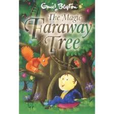
But I can only skim through Leonard’s poems quickly. Nearby is a
much younger person who wants to start reading a new book. I don’t recognise
the new cover.
Then I do. It is “The Magic Faraway Tree”.
Here we go.
Hello, Enid.
Hello, Enid.
The world of books feels like an ever-expanding galaxy just now, don't you think?
But now, decision time.
Where's that Comic Sans???
www.pennydolan.com
6 comments:
Read in haste - but a lovely post! Have thought for a long time that the way for print books to go is to make them beautiful - and your post confirms this feeling.
A luscious post - thank you!
A truly lovely post, Penny - thank you. Makes even a devoted kindle-lover like me rather wistful..
I'm glad I'm not the only one who loved this book. Had no idea Comic Sans was so reviled! The Nook is okay, but I will always read a paper book first if one is available!
It's now about three weeks since the Kindle arrived. I like it for a) making it possible to take around a choice of books for odd moments. Also b) for letting me download something I want to read so enticingly quickly - need to be wary of that! - and c) letting me get hold of material I otherwise might not get any other way. For example, I'm currently reading Len Deighton's "Bomber", which was reissued as an e-book. But I do miss the paper page and the pleasing book - and I seem to have a touch of RSI in my little finger from holding up the kindle too long and late into the night.
Brilliant post Penny. And interesting your comment about successful picture books having airy space in them... a sort of I can breath this story in. The Archie book on my post today has the same airy feeling. Do you think space and good lay-out in a book just make us relax into the story?
Post a Comment